SCREEN Readability Comparisons for
some
Popular GPS Car
Navigators
by
Joe Mehaffey
Release 2, June 28, 2005
Readers frequently ask us to "compare" this or that GPS and pick out
the best one for them. This request is impossible in the
general
case for us to answer properly. What I like in a GPS, you may
not.
Therefore, in general, we just try to give you the facts and
let
you decide what is best for you.
I got to thinking that there were a few other bits of information we
should pass on. One Question that should be on everyone's mind
when
they pick a GPS is "How readable is the screen under various light
conditions?". In this review, we will try to provide some
comparative
information for half a dozen of the better known GPS units.
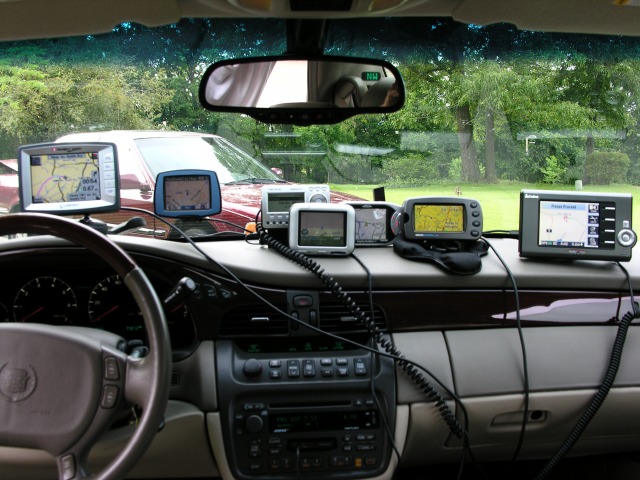
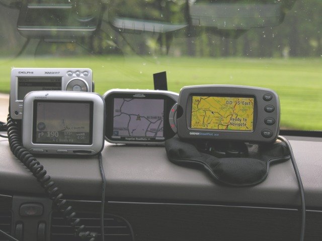
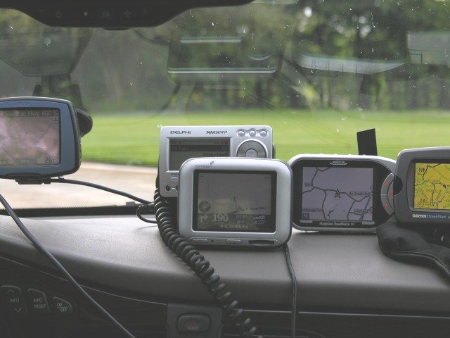
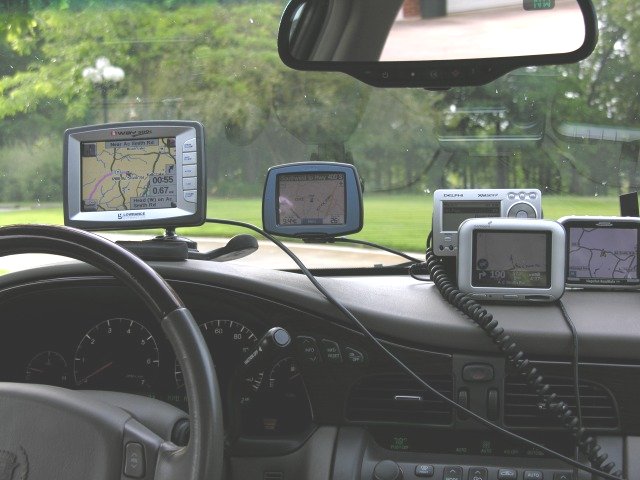
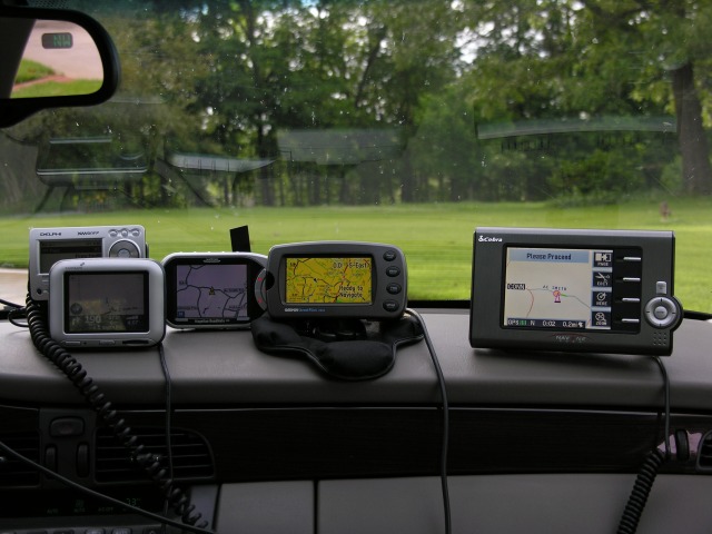
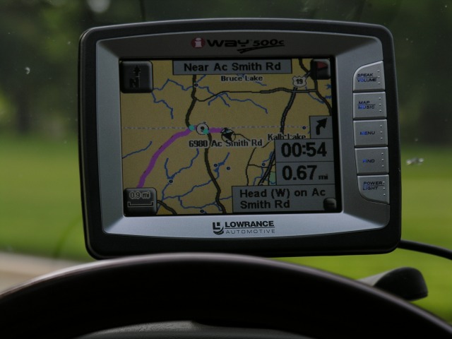
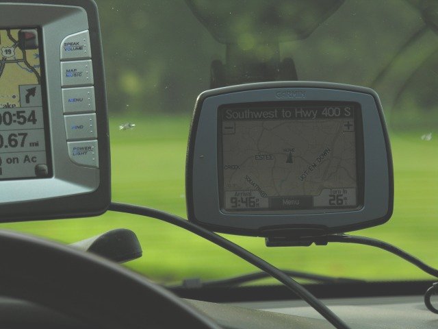
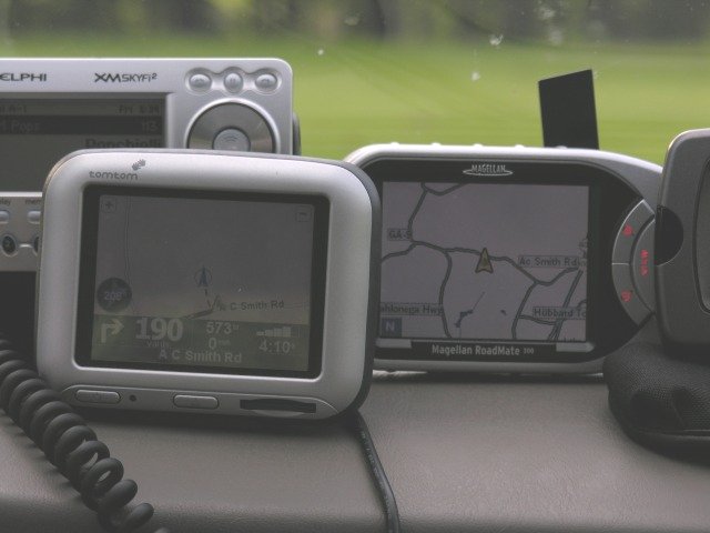
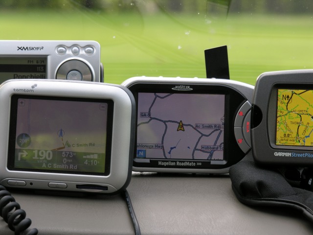
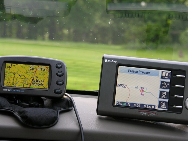
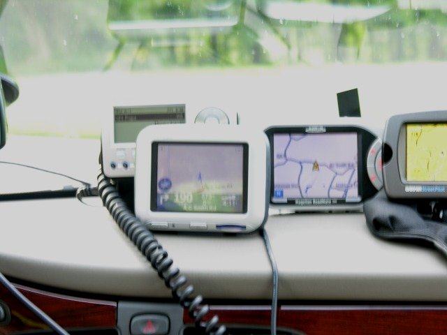
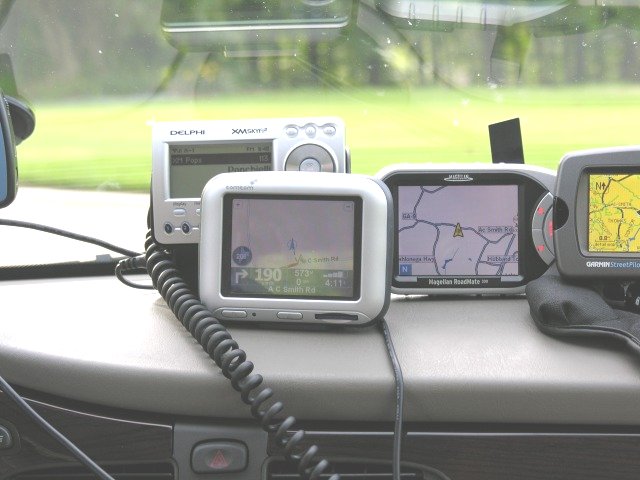
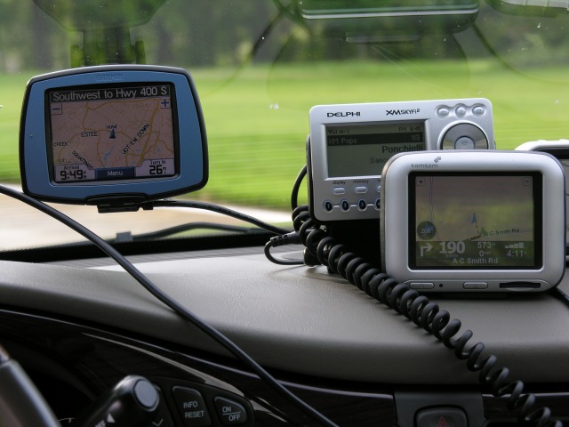
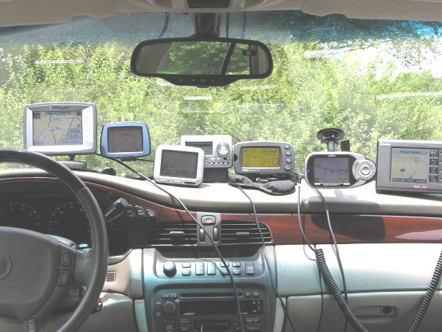
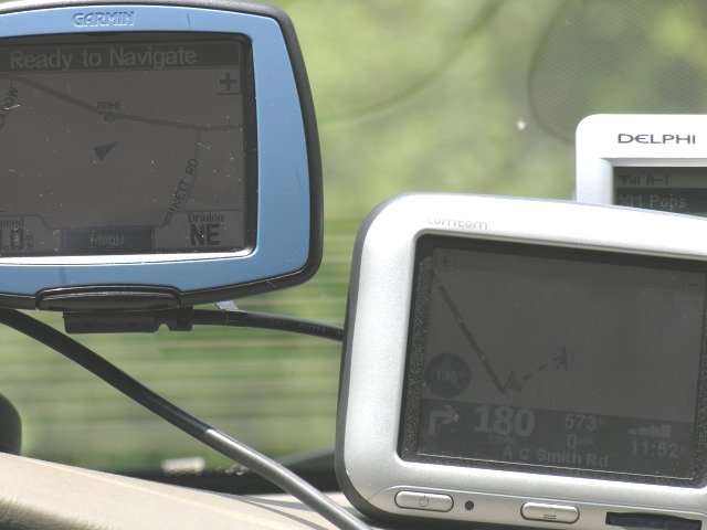
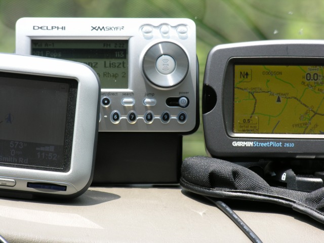
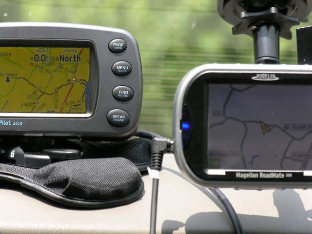
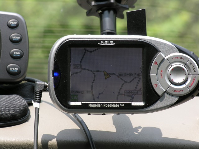
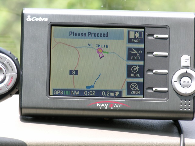
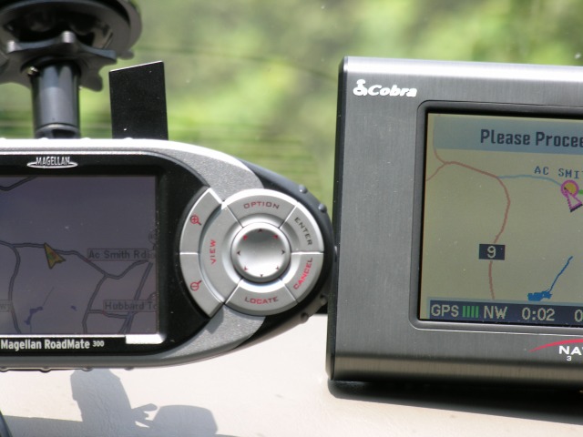
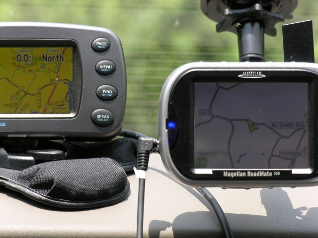
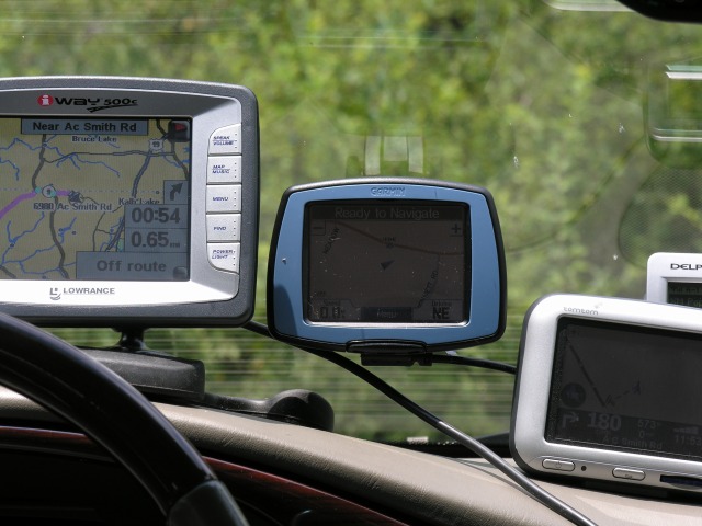
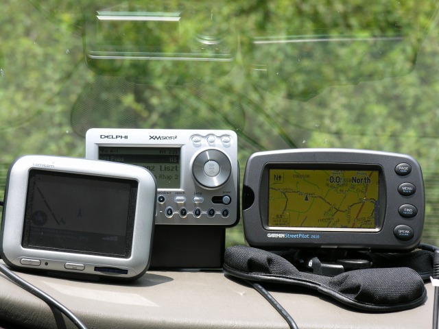
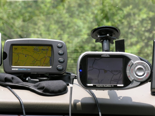
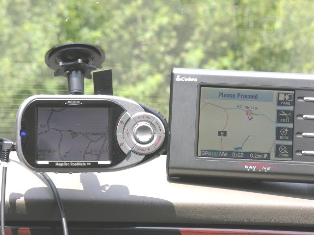
We
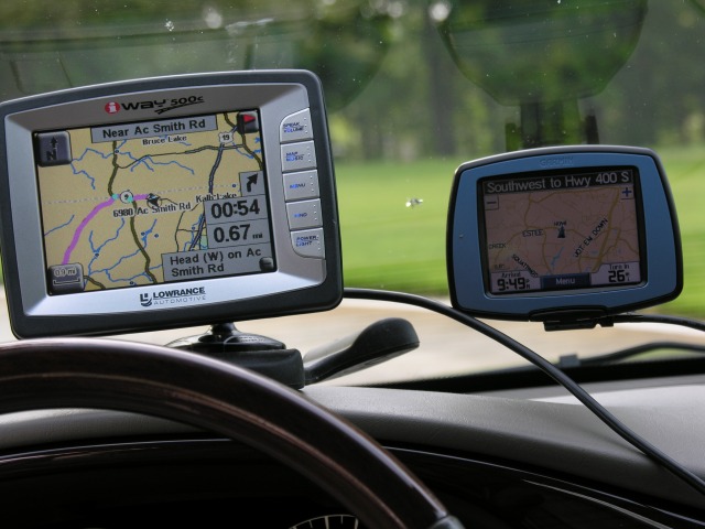
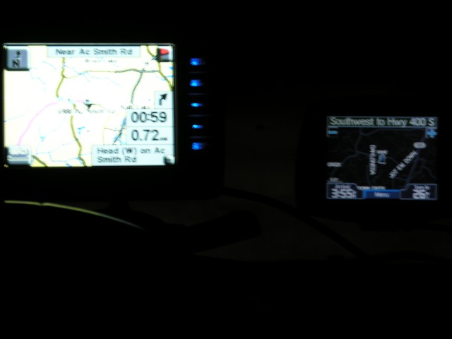
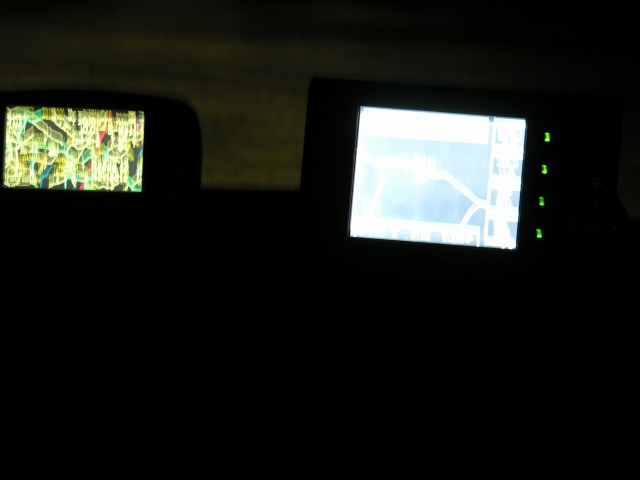
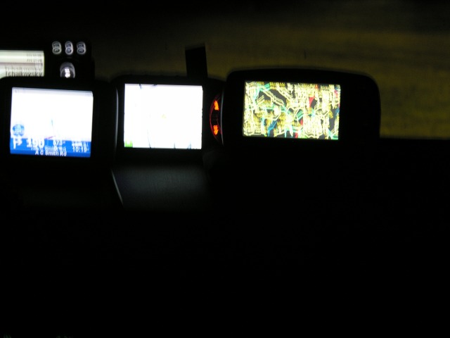
placed all these instruments on our car dash at one time so they were
approximately in the position they would be in normal operation as far
as exterior light is concerned. We made tests in bright
sunlight,
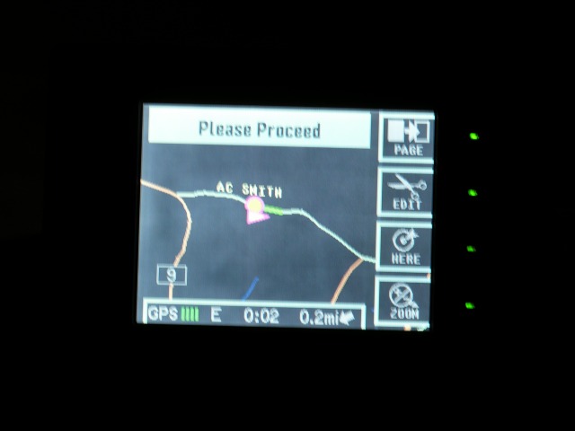
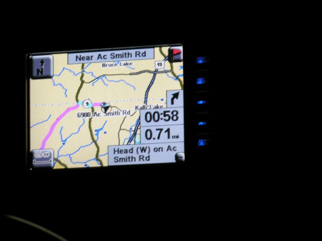
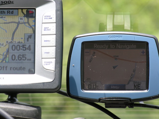
on a cloudy day and at night. Below are the comparison
photographs.
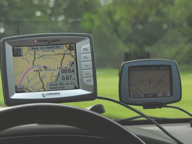
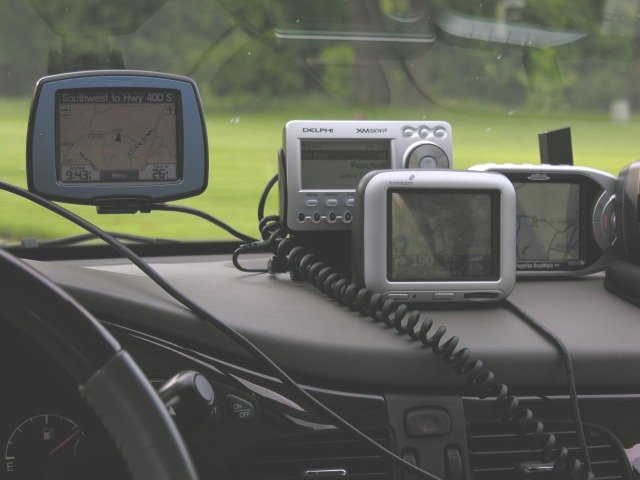
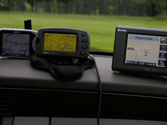
The units examined for this evaluation were, Left to Right:
Lowrance iWay 500, Garmin c320, TomTom Go, Magellan
Roadmate 300, Garmin StreetPilot 2610, and the Cobra NavOne
3000.
In the descriptions below, I give readability
ranking as
1,2,3,4,etc. If two units have the same rank, that means there were
about equally easy to read in the given ambient light.
